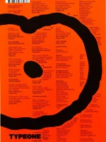
Eye Magazine, Issue 109
Shipping Class 2 = 69 SEK
Shipping Class 3 = 89 SEK EUROPE SHIPPING #1 Shipping Class 1 = 100 SEK
Shipping Class 2 = 150 SEK
Shipping Class 3 = 200 SEK EUROPE SHIPPING #2 Shipping Class 1 = 150 SEK
Shipping Class 2 = 200 SEK
Shipping Class 3 = 250 SEK EUROPE SHIPPING #3 Shipping Class 1 = 150 SEK
Shipping Class 2 = 250 SEK
Shipping Class 3 = 350 SEK OUTSIDE EUROPE SHIPPING Shipping Class 1 = 150 SEK
Shipping Class 2 = 250 SEK
Shipping Class 3 = 350 SEK
NOTE: You can buy as many items you want within the same shipping class. Read more » ×
Eye is the world’s most beautiful and collectable graphic design journal, published quarterly for professional designers, students and anyone interested in critical, informed writing about graphic design and visual culture.
In this issue:
Opinion
-
Editorial Eye 109 – John L. Walters
-
Groop dynamics – Rick Poynor
(Graphic design, illustration, music design) -
Voice at the table – Nigel Ball
(Brand madness, critical path, food design, agenda)
Features
-
Reputations: Veronika Burian – Amy Papaelias
Interview with the co-founder of TypeTogether -
Supernova – Serge Ricco
Profile of photographer and art director Harri Peccinotti -
Light fantastic – Amy Henry
Event design by Kate Dawkins -
Enough space to imagine – David Driver
Laura Carlin’s picturebook illustrations -
Atomic everyday – John L. Walters
Michael Collins’s nuclear power station photography -
Type reviews –
Dan Reynolds, Toshi Omagari, Linda Kudrnovská,
James Clough, Silvia Sfligiotti
Reviews
-
Red Square: Mary de Saulles and the 1960s BEA corporate identity
-
Typophoto: New Typography and the Reinvention of Photography
-
What Design Can’t Do: Essays on Design and Disillusion
-
Illustration: A Concise History
-
Barbara Kruger: Another Day. Another Night
-
Impact Type: Manufacturing Type for Typewriters in Switzerland, 1941–1997
-
Keep Smiling! The Printed Universe of Pontus Hultén
-
Crumb: A Cartoonist’s Life
-
Karel Martens: Unbound
-
Pictograms. Iconic Japanese Designs
-
Lessons for Young Artists
-
Lee Miller
-
A Co-Program for Graphic Design
-
Diagrams. A project by AMO / OMA
-
Disorder: Swiss Grit Vol. II
Related products
-
 Advertising - Business & Current Affairs - Creative Arts - Graphic Design
BranD No.81: Exhalation and Inhalation in Design
295 SEK -
 Architecture - Art - Literature
Harvard Design, Issue 53: Reuse and renovation
379 SEK -
 Creative Arts - Graphic Design
IdN 30.3 – ArtTech: Creative Machines, Human Visions
325 SEK -
 Graphic Design
TYPEONE Magazine, Issue 10
295 SEK


