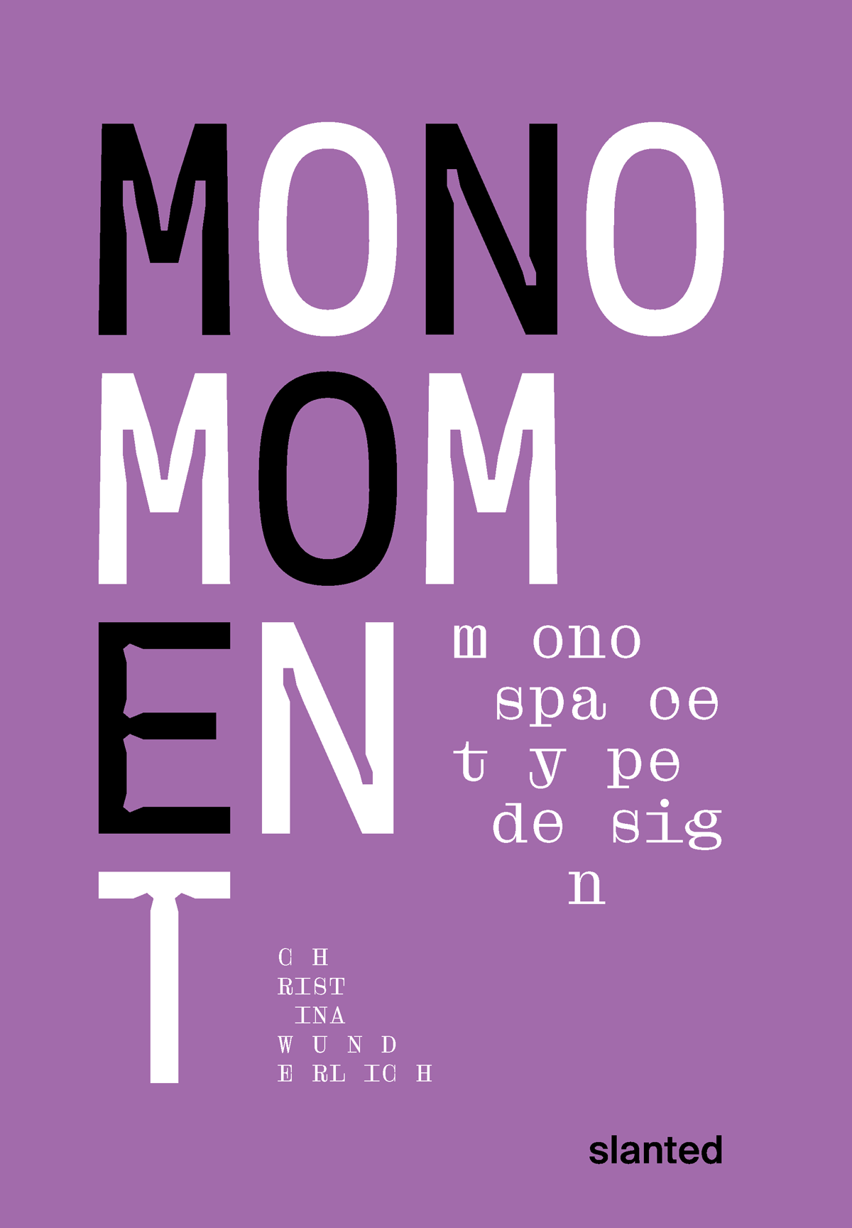
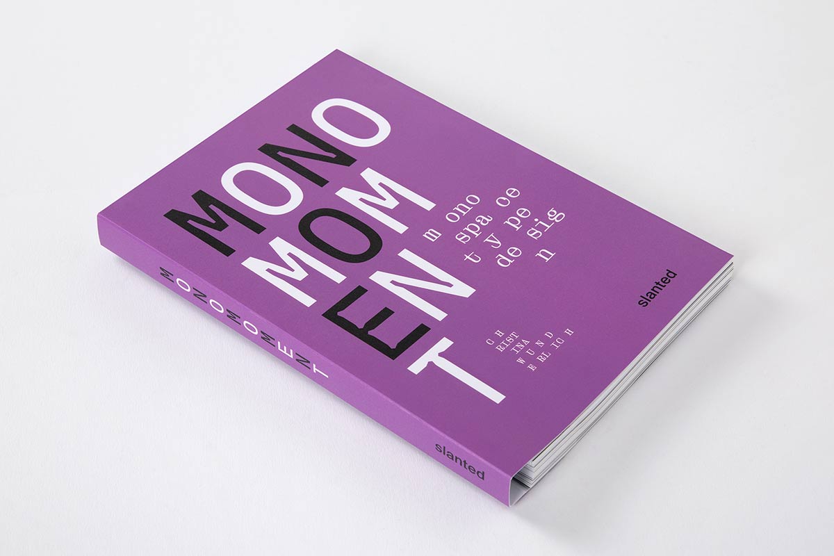
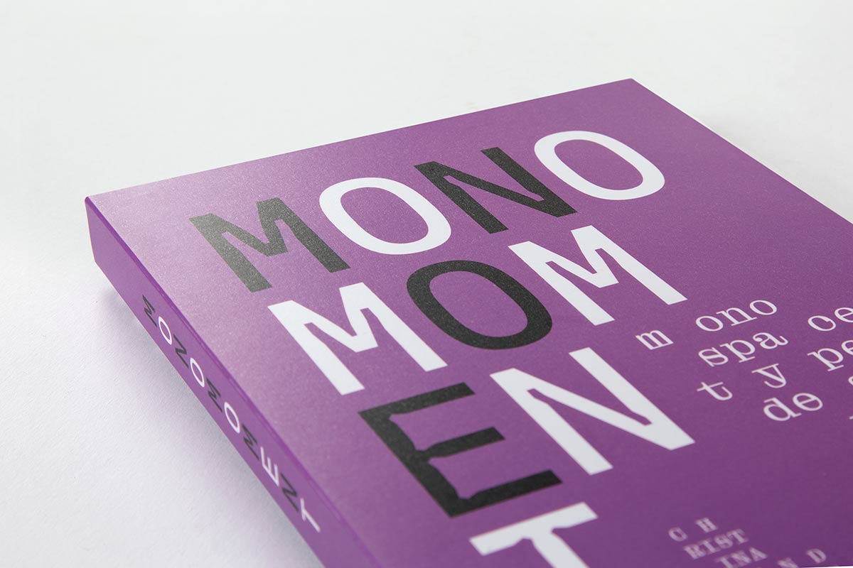
Mono Moment—Monospace Type Design
Shipping Class 2 = 69 SEK
Shipping Class 3 = 89 SEK EUROPE SHIPPING #1 Shipping Class 1 = 100 SEK
Shipping Class 2 = 150 SEK
Shipping Class 3 = 200 SEK EUROPE SHIPPING #2 Shipping Class 1 = 150 SEK
Shipping Class 2 = 200 SEK
Shipping Class 3 = 250 SEK EUROPE SHIPPING #3 Shipping Class 1 = 150 SEK
Shipping Class 2 = 250 SEK
Shipping Class 3 = 350 SEK OUTSIDE EUROPE SHIPPING Shipping Class 1 = 150 SEK
Shipping Class 2 = 250 SEK
Shipping Class 3 = 350 SEK
NOTE: You can buy as many items you want within the same shipping class. Read more » ×
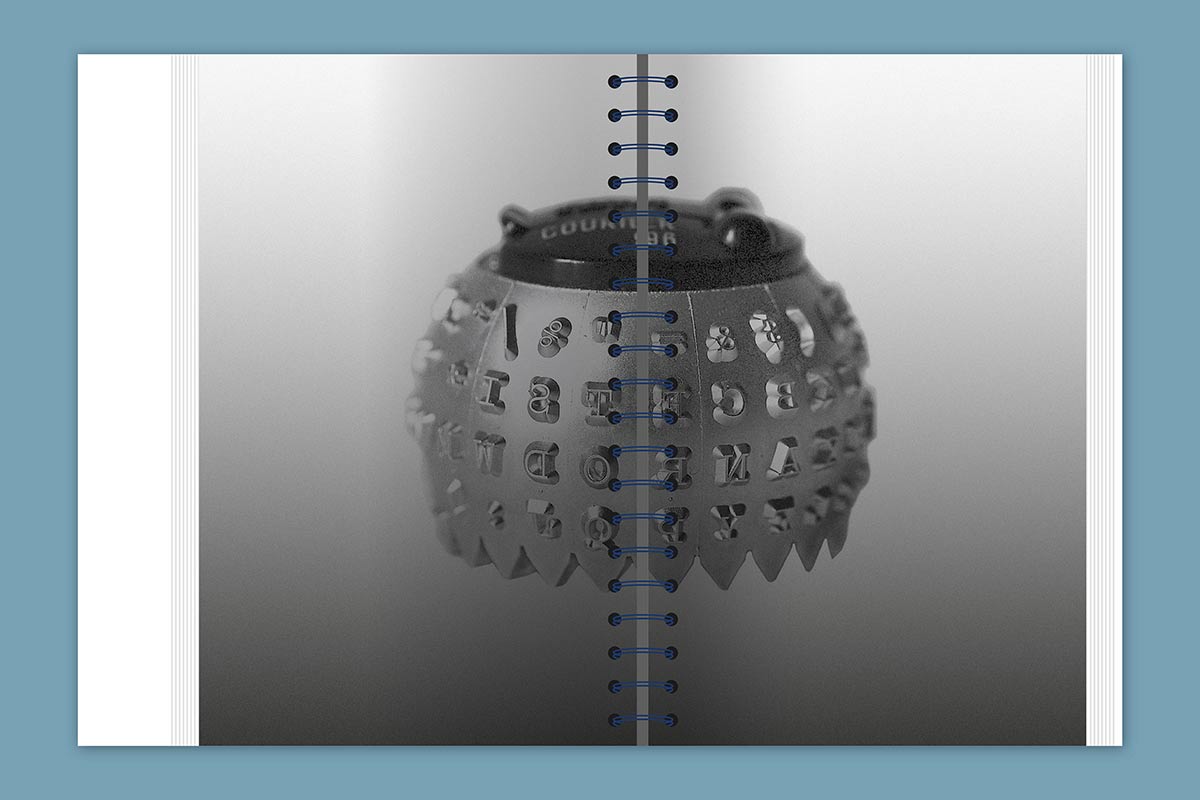
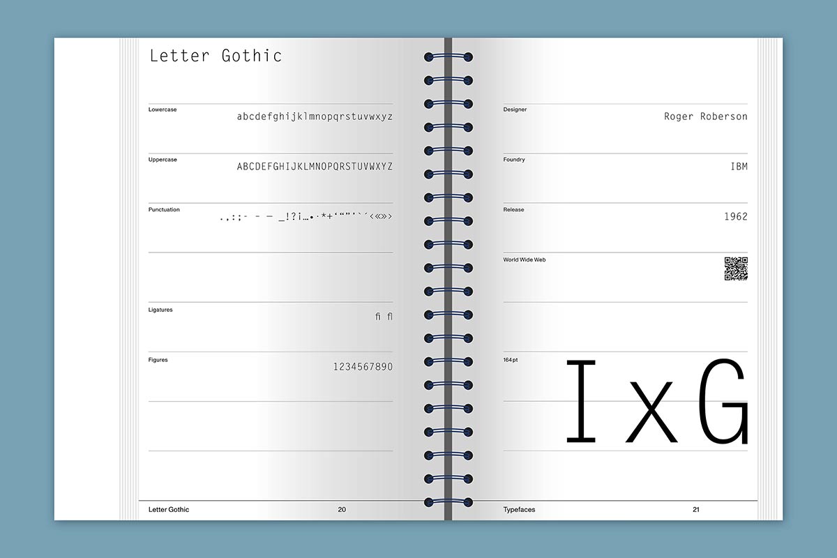
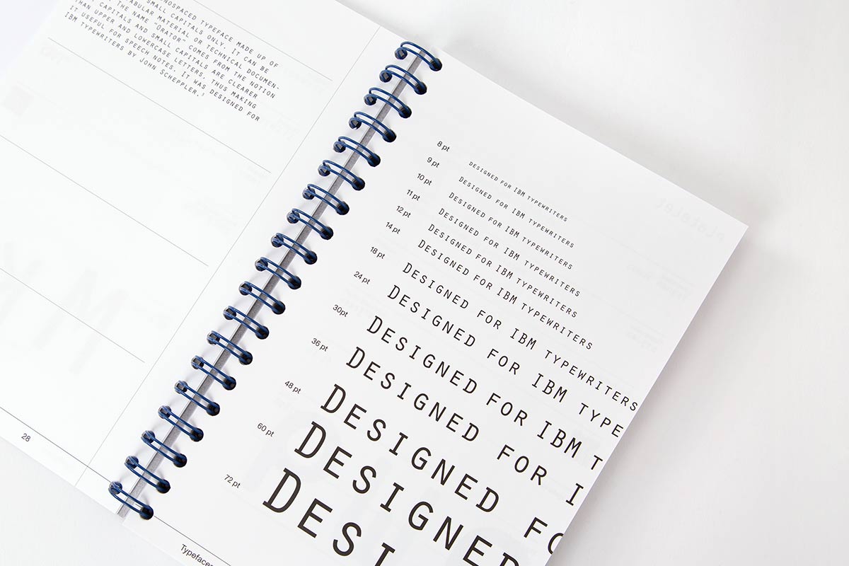
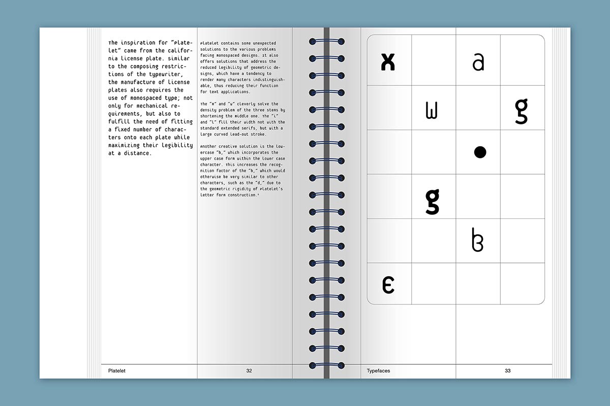
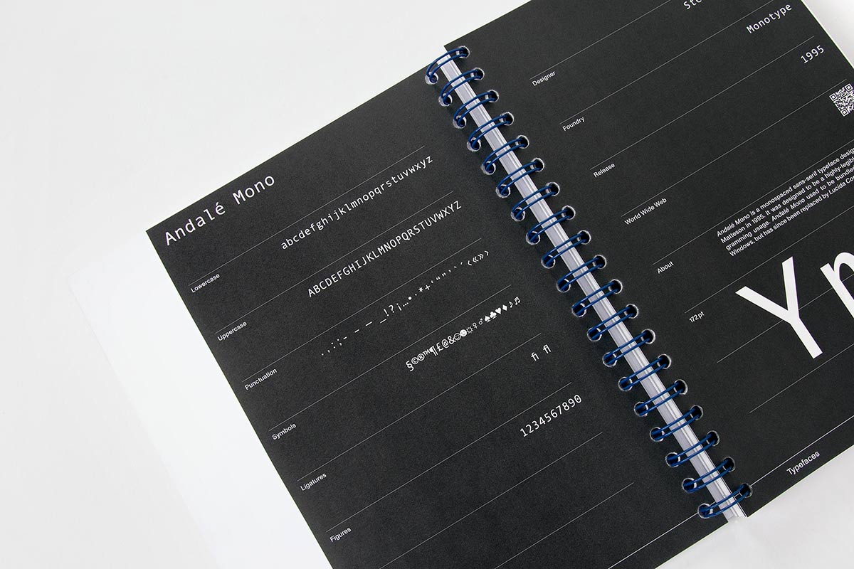
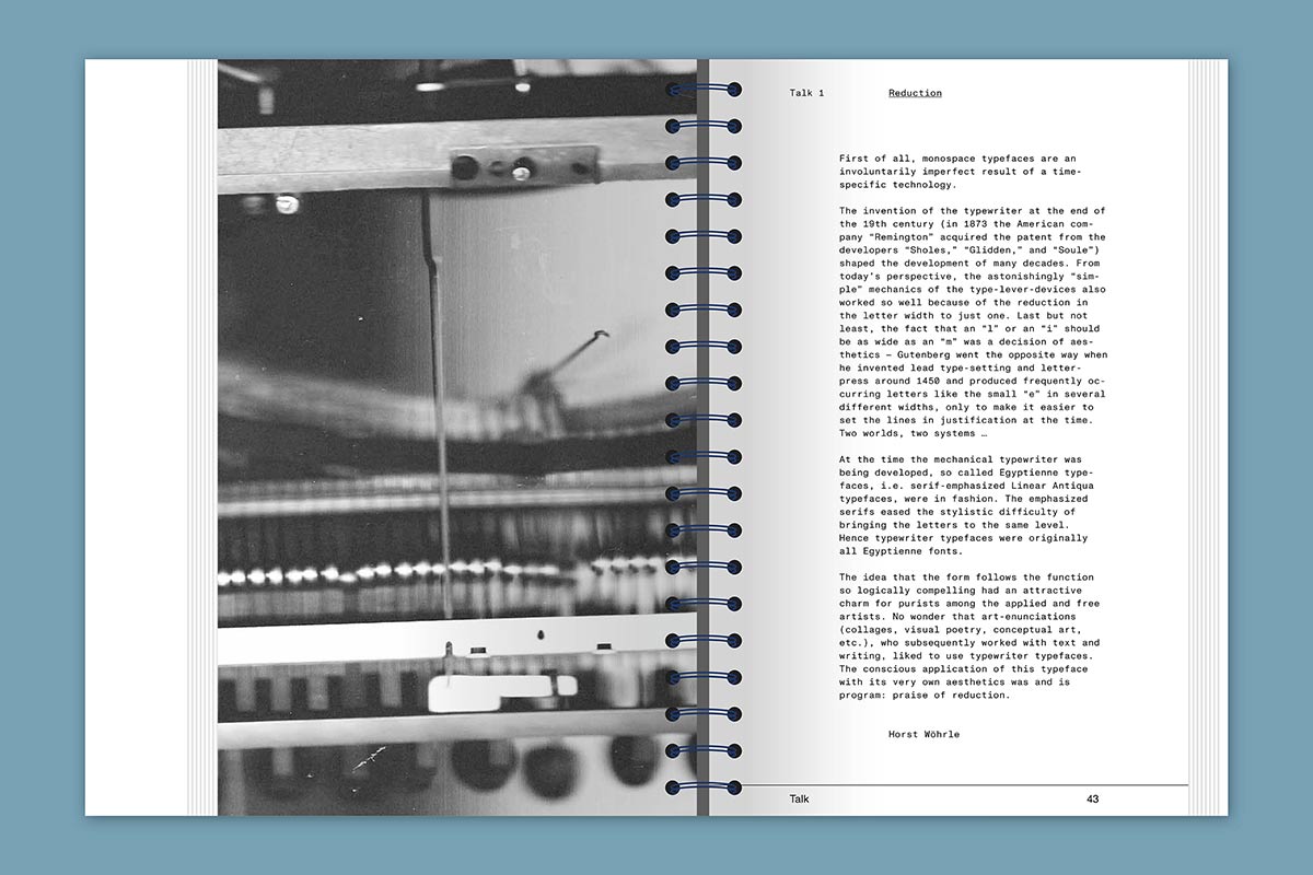
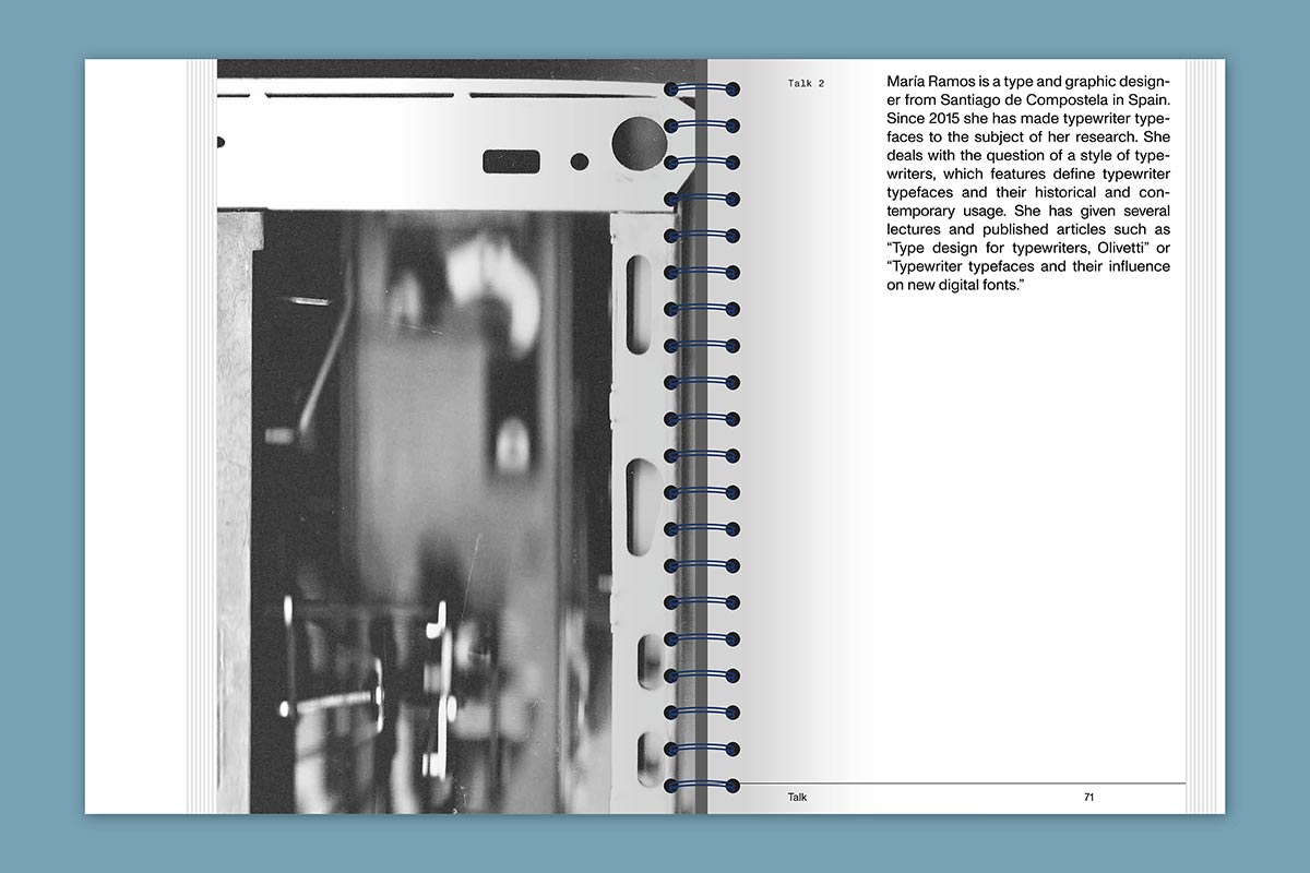
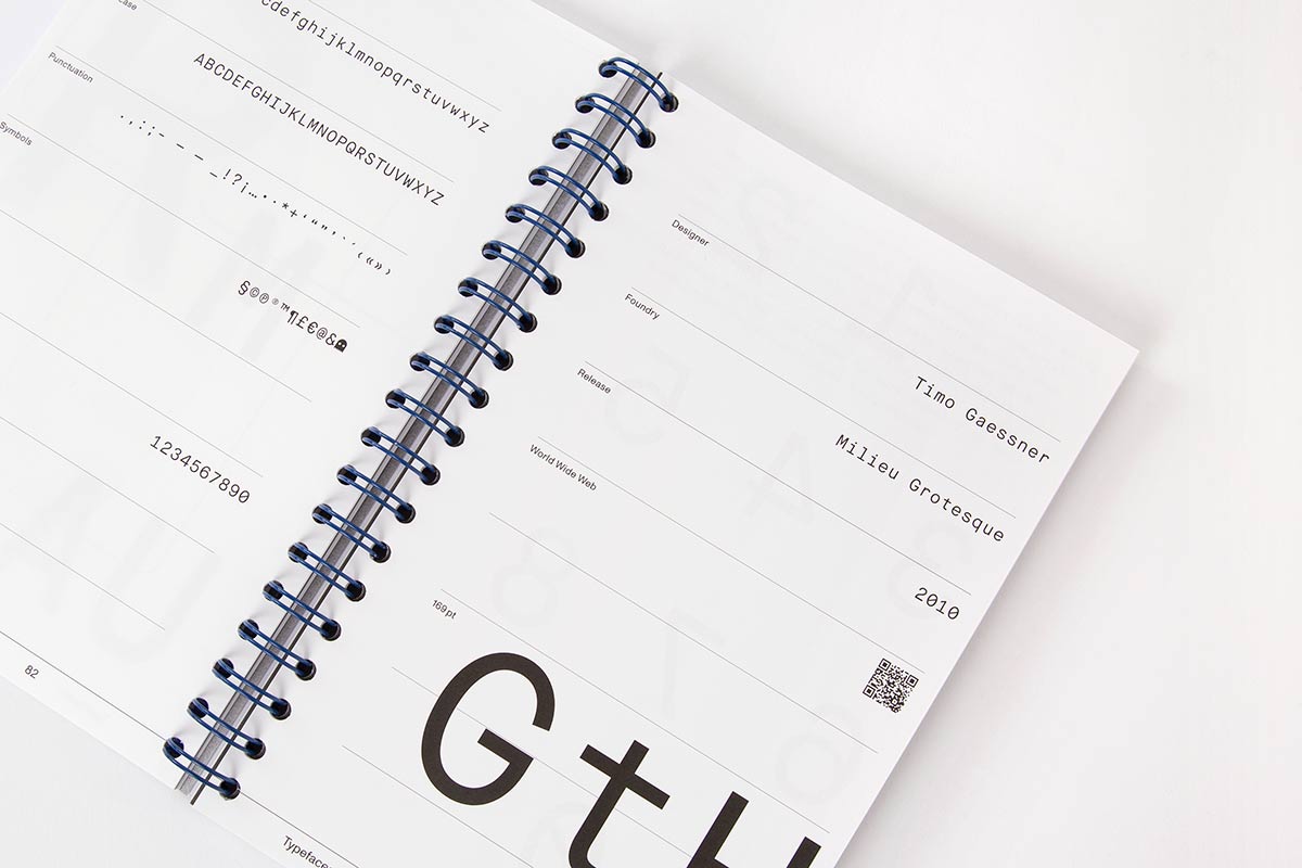
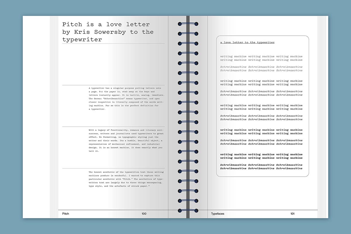
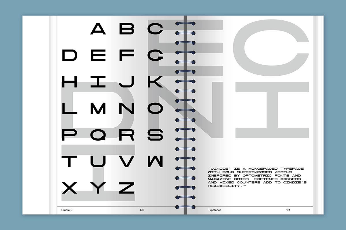
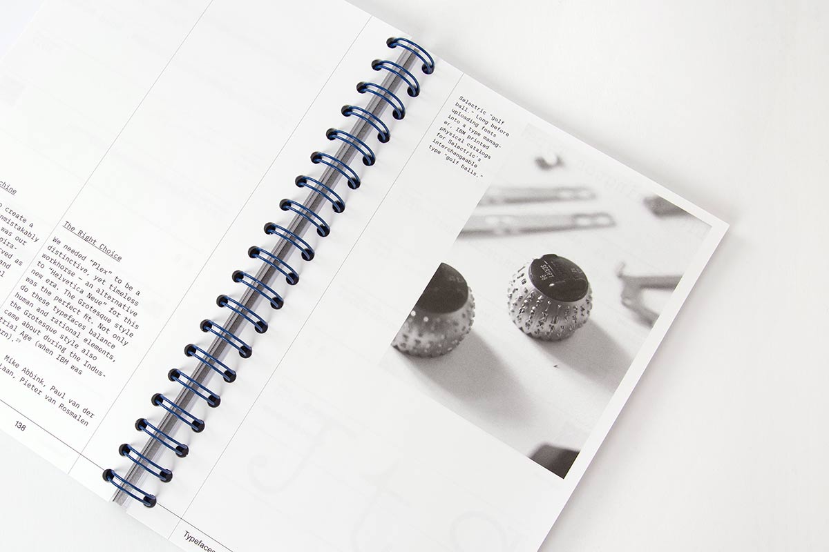
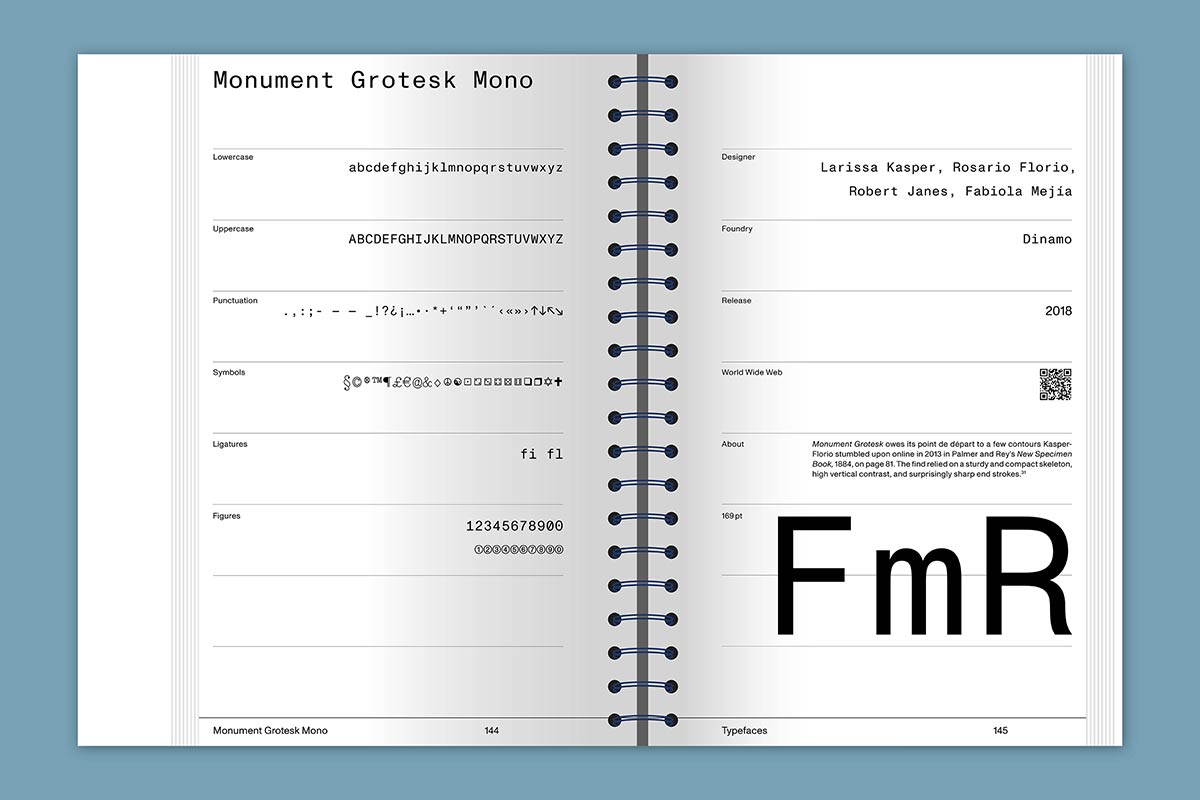
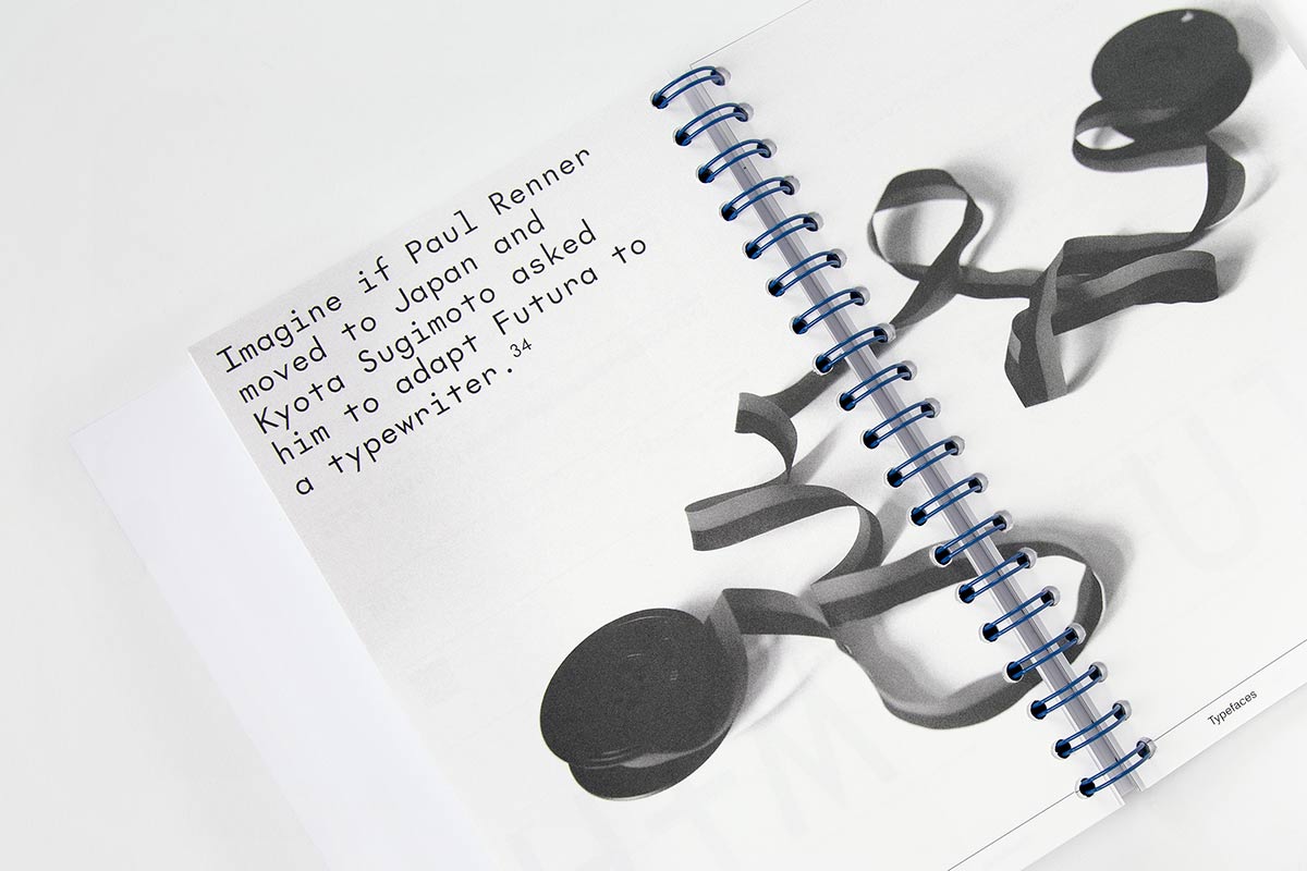
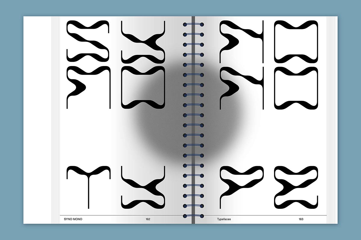
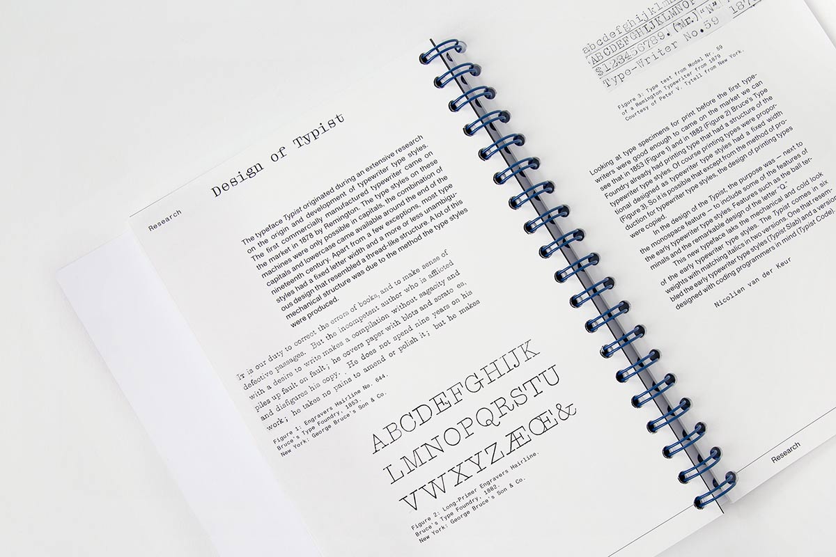
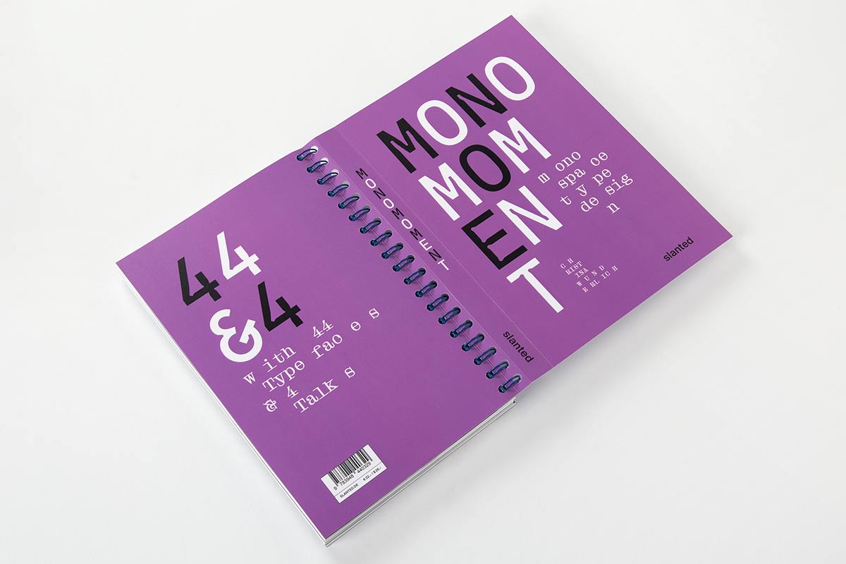
Monospaced fonts are fascinating! Mono Moment is aimed at type designers typographers and designers, but also at people who are dealing with type design for the first time. The publication thus becomes a reference book and source of inspiration!
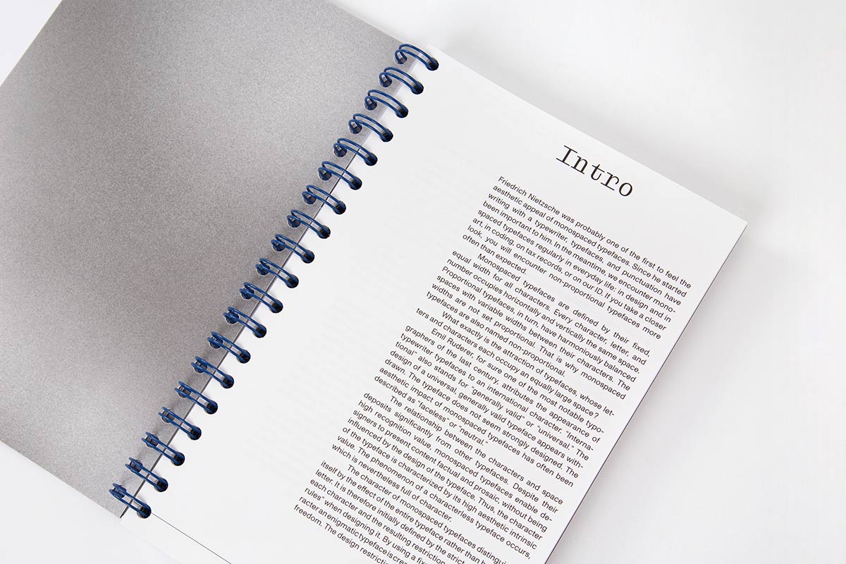
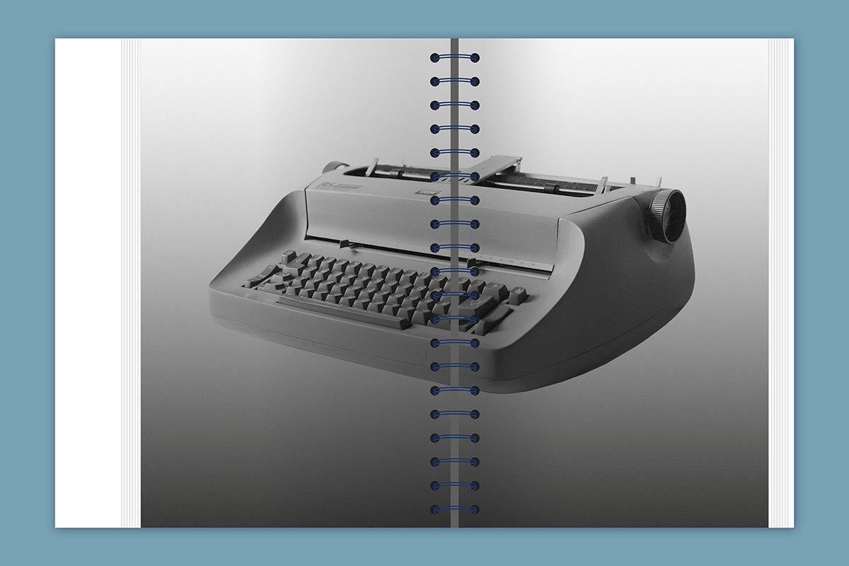
Friedrich Nietzsche was probably one of the first to feel the aesthetic appeal of monospaced typefaces. Since he started writing with a typewriter, typefaces, and punctuation have been important to him. In the meantime, we encounter monospaced typefaces regularly in everyday life: in design and in art, in coding, on tax records, or on our ID. If you take a closer look, you will encounter non-proportional typefaces more often than expected.
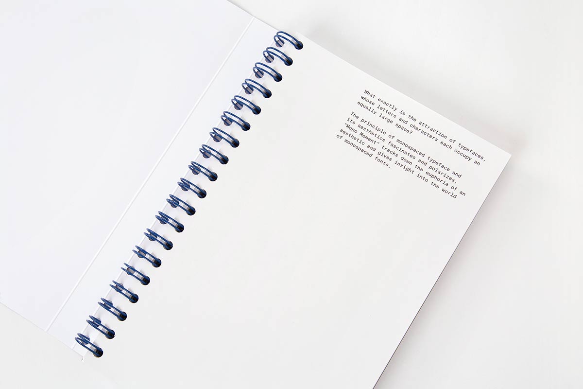
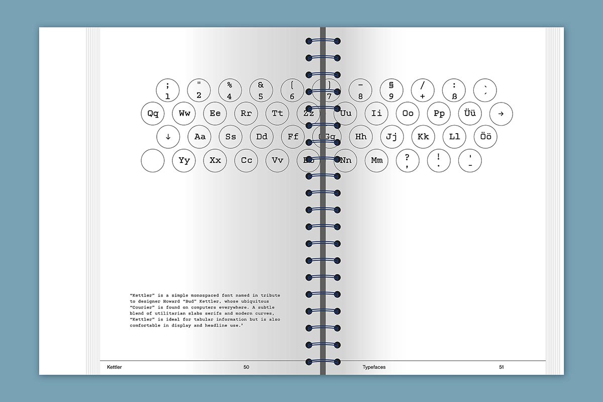
Monospaced typefaces are defined by their fixed, equal width for all characters. Every character, letter, and number occupies horizontally and vertically the same space. Proportional typefaces, in turn, have harmoniously balanced spaces with variable widths between their characters. The widths are not set proportional. That is why monospaced typefaces are also named non-proportional. What exactly is the attraction of typefaces, whose letters and characters each occupy an equally large space?
Due to the increase in typeface production over the past few decades, almost every well-developed font family also has a mono or semi-mono cut. When searching for the word “monospace” on the World Wide Web, countless entries can be found in addition to the results such as “I am looking for a beautiful monospaced font,” “Top Ten Monospace Fonts,” or “Best Monospace Fonts for Coding.” At a time when it has never been easier to design and publish typefaces, this book provides a good orientation to monospace!
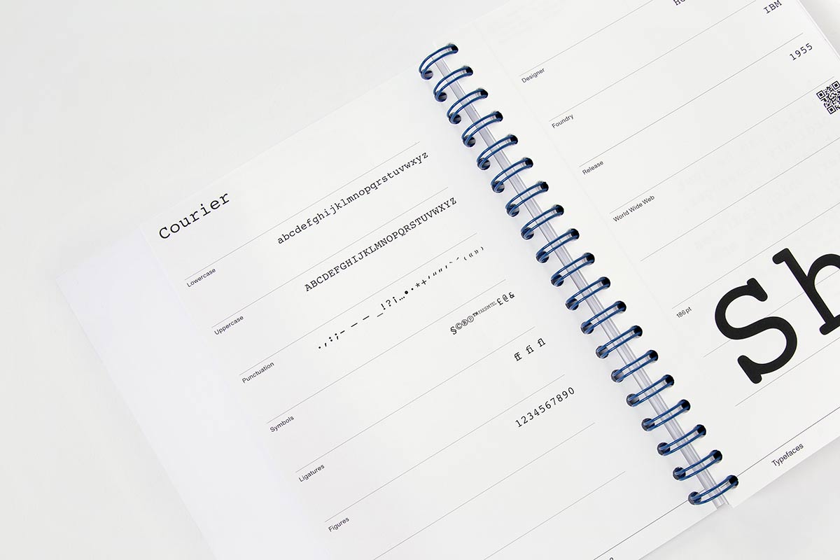
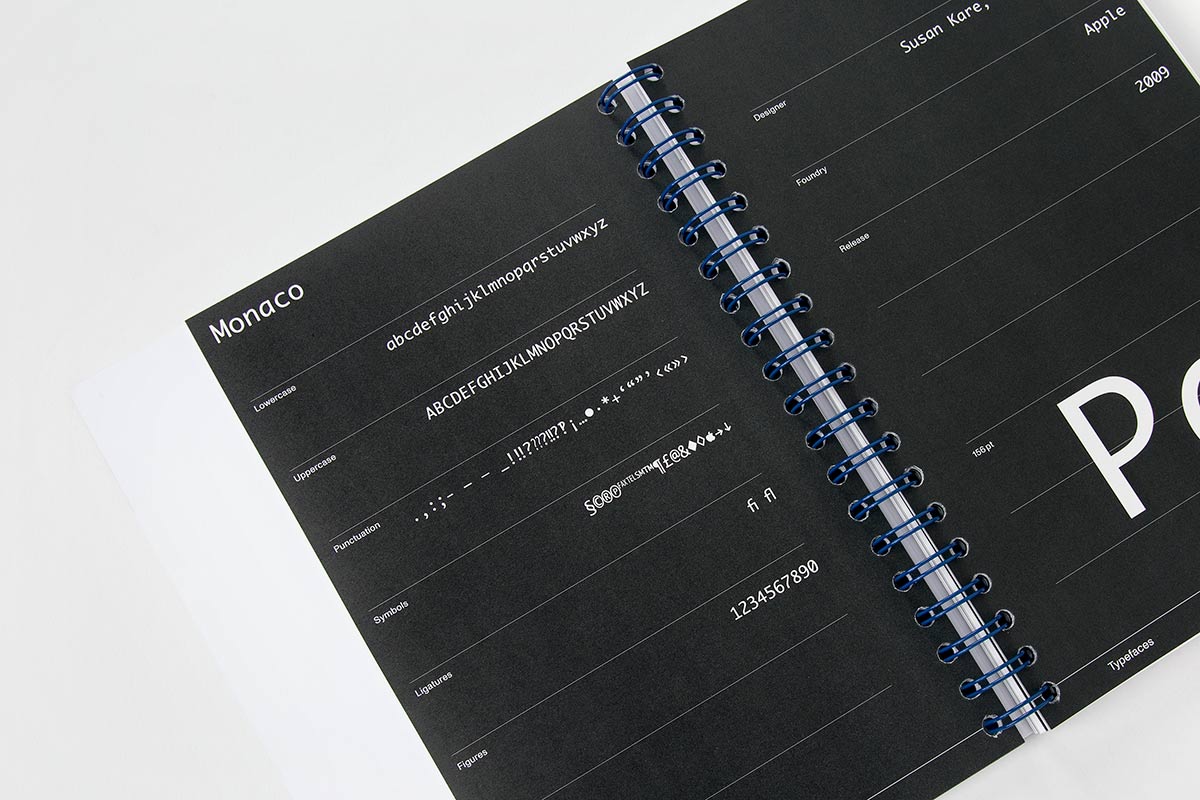
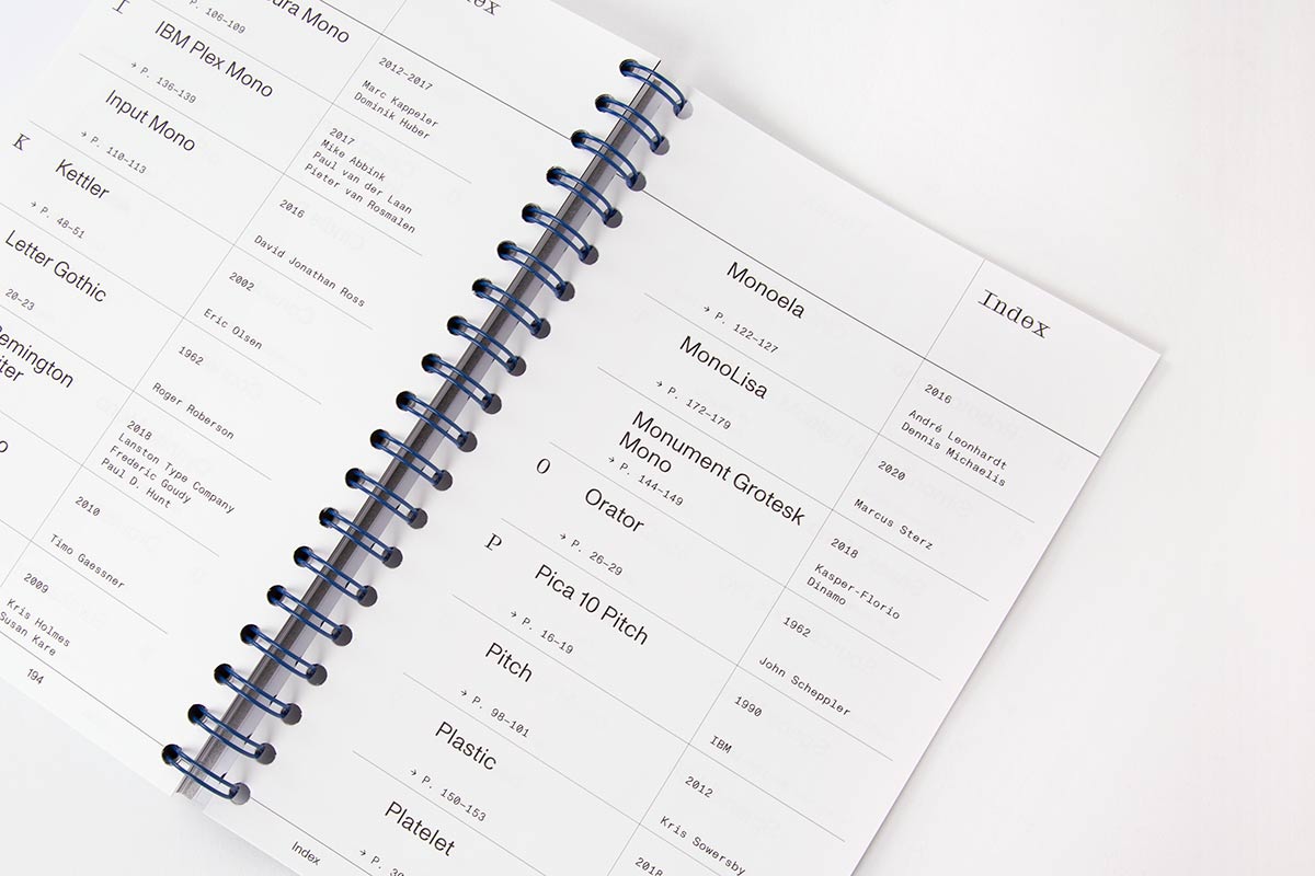
Featured typefaces: Airport Mono, Andal Mono, Anonymus Pro, AO Mono, Aperçu Mono, Atlas Typewriter, Base Mono, Basier Mono, Blue Mono, Calico Mono, Cindie D, Consolas, Courier, Cygnito Mono, Eureka Mono, GT Pressura Mono, IBM Plex Mono, Input Mono, Kettler, Letter Gothic, LTC Remington, Maison Mono, Monaco, Monoela, MonoLisa, Orator, Pica 10 Pitch, Pitch, Plastic, Platelet, Roboto Mono, Simon Mono Light, Sneak Mono, Source Code Pro, Space Mono, Splendid 66, Sudo, Suisse Int’l Mono, SYNO MONO, The Future Mono, TheSans Mono, Typist Code, Typist Slab, Ubuntu Mono, and Vulf Mono.
Related products
-
Design - Visual Culture
Flexible Visual Systems
Flexible Visual Systems sums up 10 years of research at the University of Barcelona, 20 years of developing systems at TwoPoints.Net and 18 years of teaching systems at over 10 design universities throughout Europe on 320 pages. Flexible Visual Systems is the design manual for contemporary visual identities. It teaches you a variety of approaches […]
695 SEK -
Graphic Design
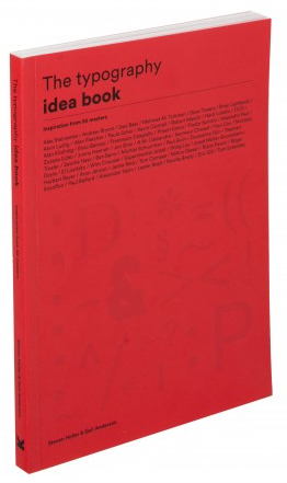
The Typography Idea Book: Inspiration from 50 Masters
Playing with typographic puzzle pieces is one of the joys of graphic design and typographers have many entertaining, esoteric and eccentric options at their disposal. The Typography Idea Book presents 50 of the most inspiring approaches used by masters of the field from across the world. Geared towards helping you evolve different typographic styles, the […]
245 SEK -
Graphic Design
Slanted, Issue 47 – Digital Tools
Slanted started with a Weblog in 2004. The first magazine issue was published 2005. Slanted is the first German magazine devoted to typography…..
295 SEK

