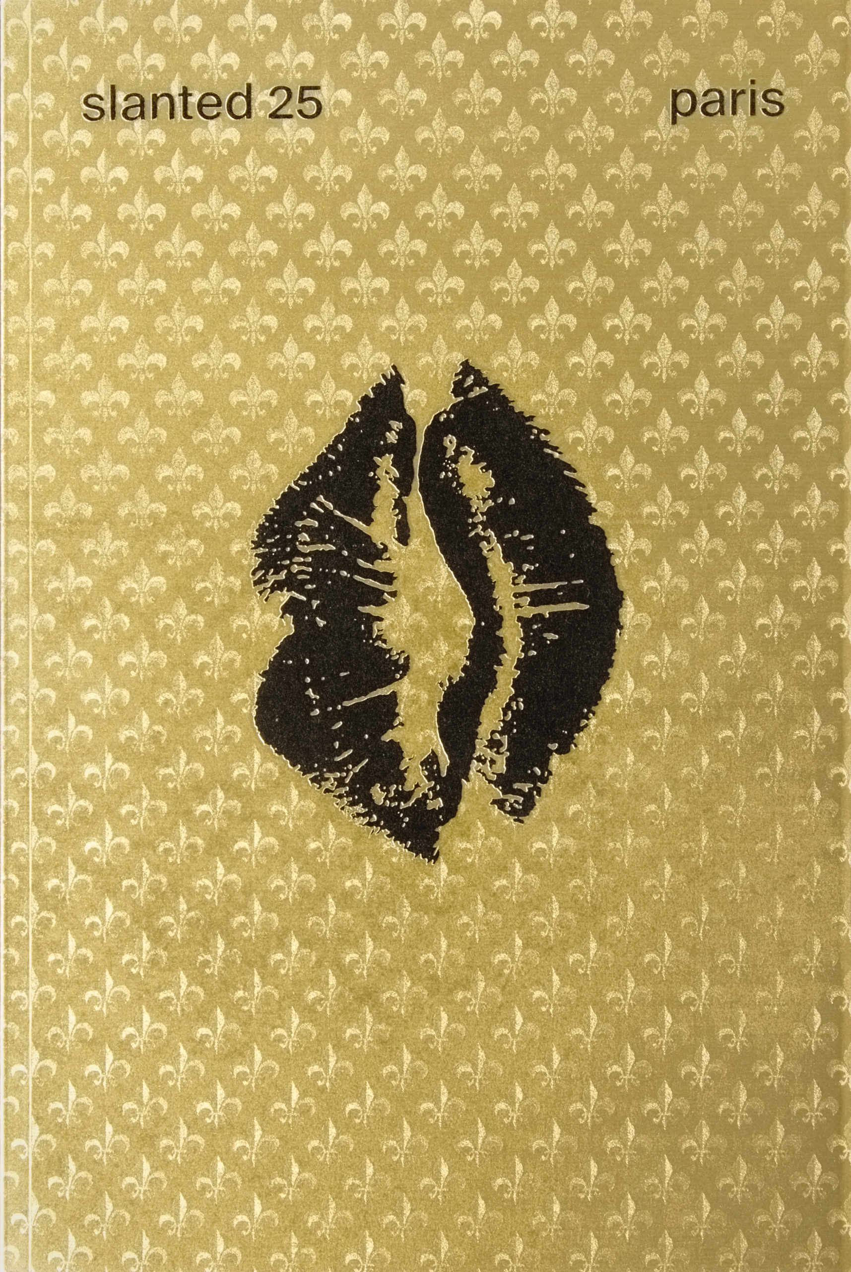


Slanted, Issue 25 – Paris
Shipping Class 2 = 60 SEK
Shipping Class 3 = 90 SEK EUROPE SHIPPING Shipping Class 1 = 100 SEK (approx 10 EUR)
Shipping Class 2 = 150 SEK (approx 15 EUR)
Shipping Class 3 = 200 SEK (approx 20 EUR) OUTSIDE EUROPE SHIPPING Shipping Class 1 = 150 SEK (approx 15 USD)
Shipping Class 2 = 200 SEK (approx 20 USD)
Shipping Class 3 = 300 SEK (approx 30 USD)
NOTE: You can buy as many items you want within the same shipping class. Read more » ×
Slanted started with a Weblog in 2004. The first magazine issue was published 2005.
Slanted is the first German magazine devoted to typography. It takes an interdisciplinary approach, and has been designed to complement the highly- frequented internet blog at www.slanted.de.
The main focus of Slanted is typography found within design, illustration and photography, but a variety of other topics — related both directly and indirectly to the field — are also addressed. The magazine contains expertise analyses and reports, as well as information on typographic experimentation, portraits and interviews with todays superstars and underground players on the international scene of typography and design. All of this is presented alongside spectacular, first-class graphics and thought-provoking photography.
In this issue:
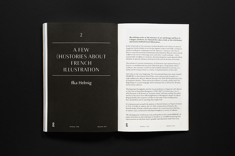
Loved and hated, hated and loved—seemingly no other European nation has a similarly segmented relationship to their capital as the French. Everything starts in Paris and everything conspires here. The city is the undisputed center of gravity of the country—almighty and omnipresent. All power originates and disperses from the city; politics, economics and culture.
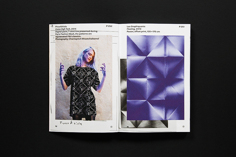
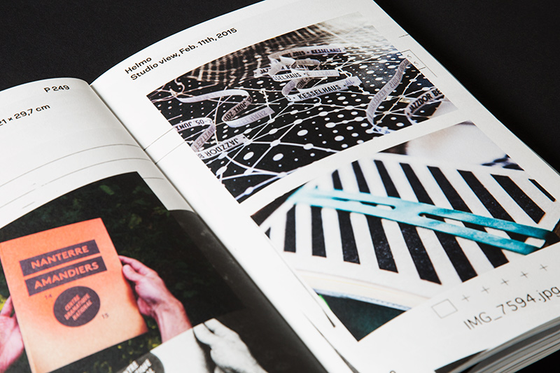
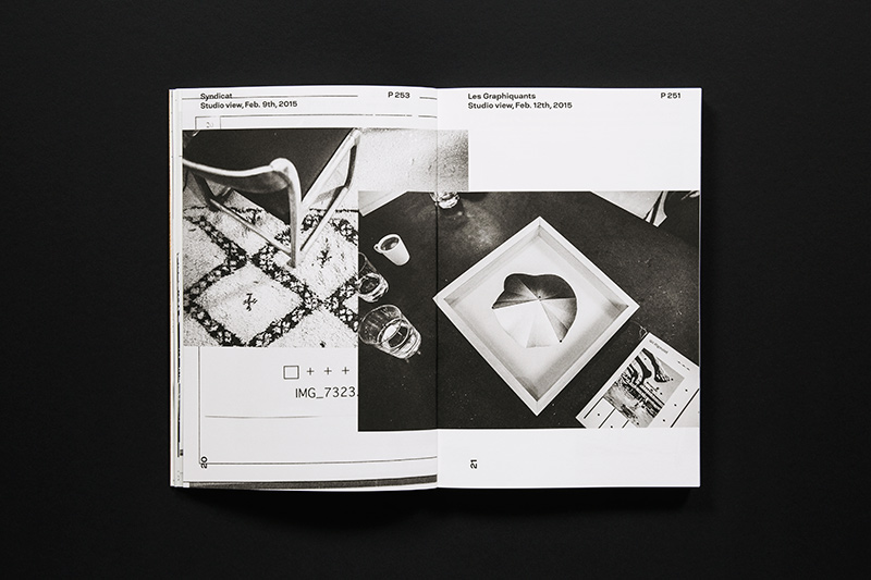
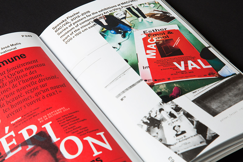
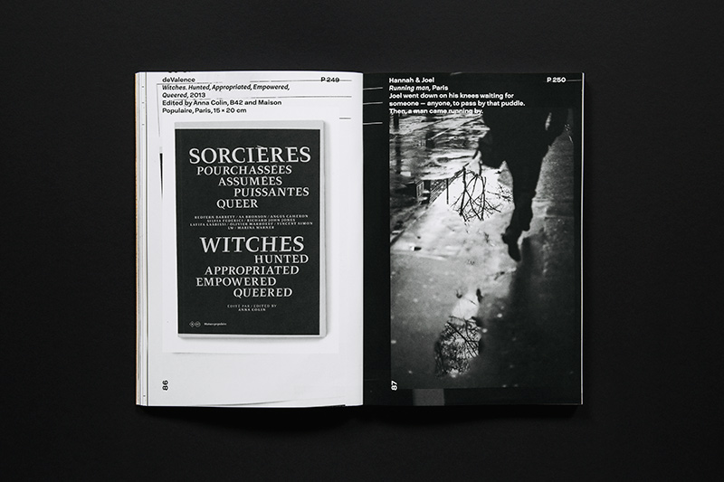
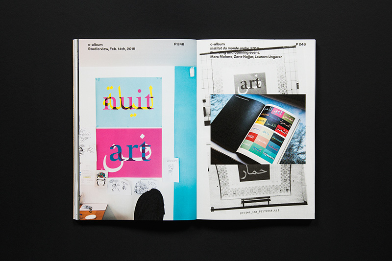
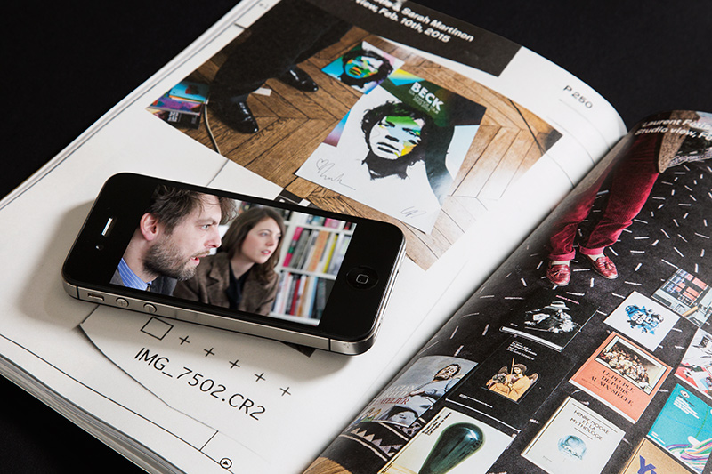
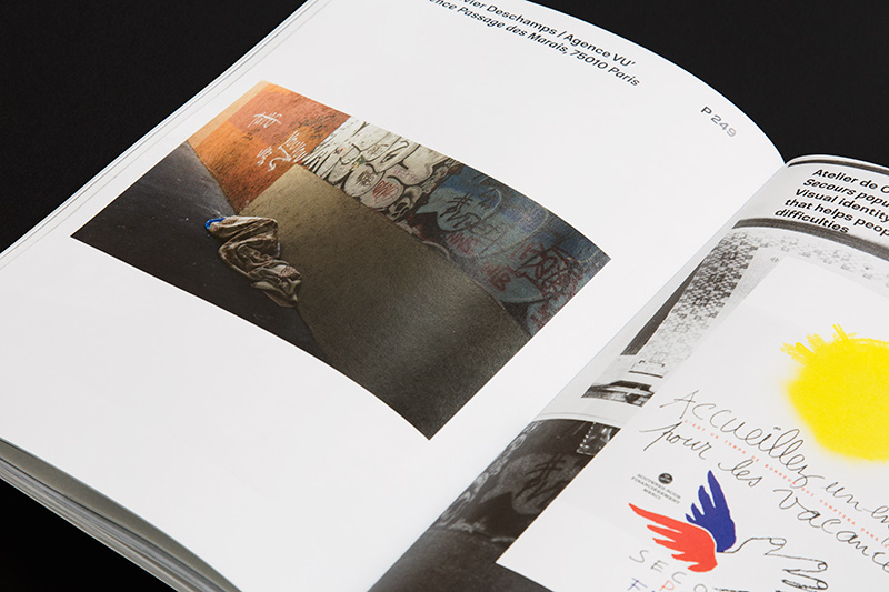
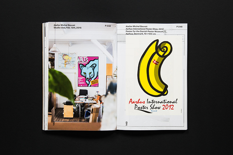
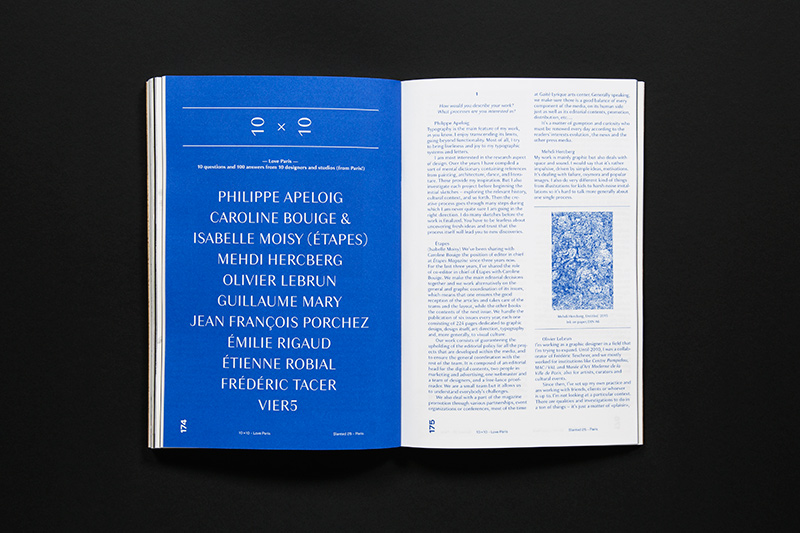
In February 2015, the Slanted editors embarked on a one-week-trip to Paris to take a close-up look at contemporary design work and the loved and hated capitol of France. The Slanted team met 18 design studios and found a virtuosic approach on the unconcealed wounds and contradictions of a rapidly changing society as well as spirit and humor as a subversive armamentarium. They produced comprehensive studio portraits which provide a vivid and up-to-the-minute picture of the scene.
The resulting video interviews have been enriched with video material from the Shutterstock collection. Thanks to Augmented Reality and the Junaio app, readers can easily watch embedded videos of the Paris trip on mobile devices. Additionally, some of the videos can be watched online for free at slanted.de/videos
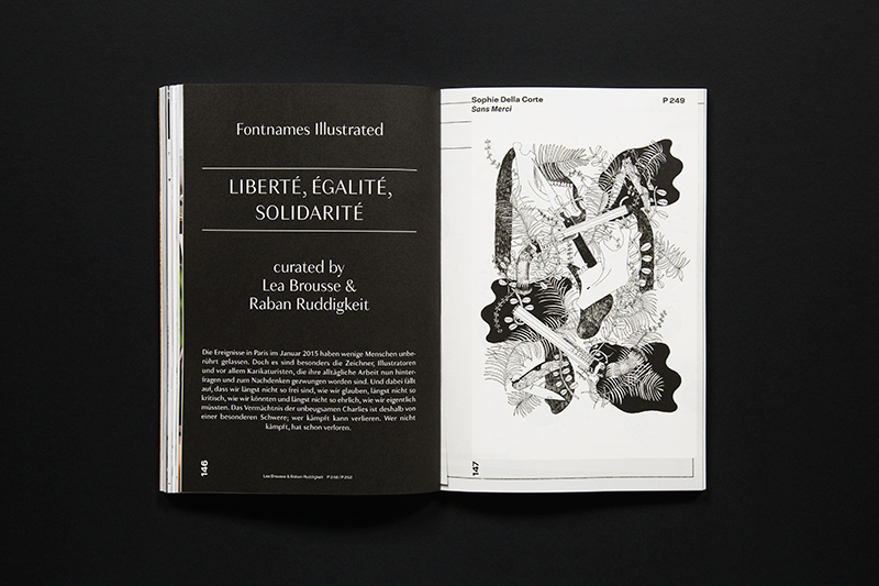
The issue is thematically complemented by illustrations, photography and fine art from contemporary culture.
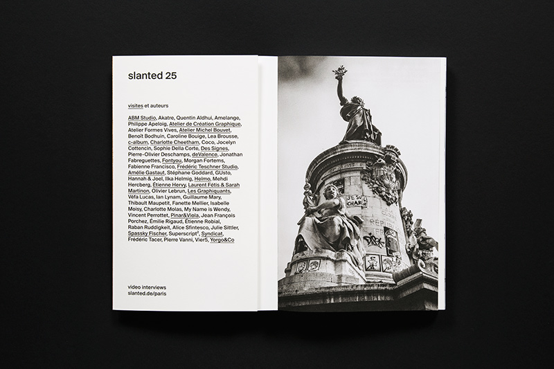
visites et auteurs: ABM Studio, Akatre, Quentin Aldhui, Amelange, Philippe Apeloig, Atelier de Création Graphique, Atelier Formes Vives, Atelier Michel Bouvet, Benoît Bodhuin, Caroline Bouige, Lea Brousse, c-album, Charlotte Cheetham, Coco, Jocelyn Cottencin, Sophie Della Corte, Des Signes, Pierre-Olivier Deschamps, deValence, Jonathan Fabreguettes, Fontyou, Morgan Fortems, Fabienne Francisco, Frédéric Teschner Studio, Amélie Gastaut, Stéphane Goddard, GUsto, Hannah & Joel, Ilka Helmig, Helmo, Mehdi Hercberg, Étienne Hervy, Laurent Fétis & Sarah Martinon, Olivier Lebrun, Les Graphiquants, Véfa Lucas, Ian Lynam, Guillaume Mary, Thibault Maupetit, Fanette Mellier, Isabelle Moisy, Charlotte Molas, My Name is Wendy, Vincent Perrottet, Pinar&Viola, Jean François Porchez, Émilie Rigaud, Étienne Robial, Raban Ruddigkeit, Alice Sfintesco, Julie Sittler, Spassky Fischer, Superscript, Syndicat, Frédéric Tacer, Pierre Vanni, Vier5, Yorgo&Co.
The booklet “Contemporary Typefaces” presents fourteen recently published typefaces we think are important and interesting: Amster (Francisco Gálvez / PampaType), Beausite (Yassin Baggar / Fatype), Berlingske (Jonas Heksher / Playtype), Christel (Sascha Timplan / Stereotypes), Duwal Pro (Dennis Dünnwald / VolcanoType), Gemeli Micro (Jean-Baptiste Levée / Production Type), Kraaken FY (Fontyou graphic and type team / Fontyou), Mislab (Xavier Dupré / Typofonderie), Patron (Timo Gaessner / Milieu Grotesque), Plaak (Damien Gautier / Éditions deux-cent-cinq), Superb (Paco González / Resistenza), Taz Wide & Extended (Luc(as) de Groot / LucasFonts), UIB (Damiá Rotger Miró / Ductil), Woodkit (Ondrej Job / Typotheque)
Related products
-
![]() Graphic Design
Graphic DesignSlanted, Issue 43 – Ukraine
Slanted started with a Weblog in 2004. The first magazine issue was published 2005. Slanted is the first German magazine devoted to typography…..
279 SEK -
![]() Graphic Design
Graphic DesignTYPEONE Magazine 08 – The Japanese Graphic Design x Typography Issue
TYPEONE is our new bi-annual magazine that uses creative type mediums as a gateway to explore topics such as culture, business, technology, innovation, and design. All these explorations lead by our TYPE01 team and network of freelancers discuss global initiatives, projects, campaigns, and the people behind them — spotlighting the next generation and featuring a […]
295 SEK


Top 10 Magazines - May 2024
-
 Copy, Issue 2 Magazines 399 SEK
 -
 Ark Journal, Volume VI (Cover A) Magazines 349 SEK
 -
 The Gentlewoman, Issue 29 – SS24 Magazines 225 SEK
 -
 Union, Issue 18 Magazines 449 SEK
 -
 Openhouse, Issue 19 (Cover A) Magazines 295 SEK
 -
 L’Étiquette, Issue 12 Magazines 195 SEK
 -
 Disco Pogo, Issue 5 (Bicep) Magazines 245 SEK
 -
 Holiday, Issue 393 – The Kathmandu Issue Magazines 395 SEK
 -
 Lodestars Anthology, Issue 4 – Italy Revisited Magazines 245 SEK
 -
 Noble Rot, Issue 34 – Alpine Winos Magazines 195 SEK